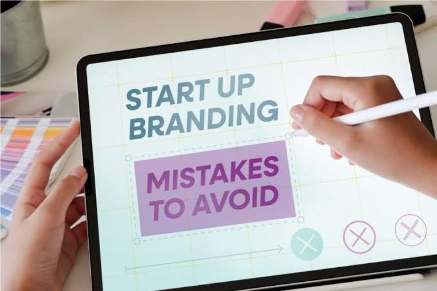
Digital design has changed the way we communicate ideas. A few lines of text can now become a polished social media graphic, an engaging presentation, an animated headline, or an interactive website element. This shift has made visual communication more flexible and has encouraged creators to think beyond traditional text-based formats.
Turning words into visuals is not simply about adding decorative elements. Good design helps people understand information, notice important ideas, and remember a message. By combining thoughtful typography, color, imagery, spacing, and modern digital tools, creators can transform ordinary text into visual experiences that feel more engaging and purposeful.
Why Text Needs Visual Support
Text remains one of the most important ways to communicate information online, but large blocks of plain text can be difficult to process. Visual elements help break information into manageable sections and provide cues that guide readers through a message.
Consider a social media post announcing a new service. A paragraph describing the service may contain useful information, but a strong headline, supporting graphic, and clear call to action can communicate the main idea much faster.
Visual Hierarchy Makes Information Easier to Follow
The first step is deciding which parts of the message deserve the most attention. A headline might need to be larger than supporting text, while a key statistic could be highlighted with a contrasting color or different font weight.
This creates a visual hierarchy that guides the viewer naturally. Instead of presenting every piece of information with equal importance, the design tells people where to look first and what to read next.
Typography Can Become a Design Element
Typography is often treated as a functional part of a design, but it can also become one of its most expressive elements. Font choices, spacing, size, alignment, and visual treatments can completely change how a message feels.
A bold geometric font might give a technology campaign a modern appearance, while a handwritten style could create a more personal feeling for a creative project.
Experiment With Text Treatments
Digital tools make it easier to experiment with typography without manually creating every effect from scratch. Designers can explore gradients, textures, shadows, outlines, distortions, and dimensional appearances.
For creators who want to explore different visual treatments, an AI text effects generator can help produce ideas for transforming ordinary words into more distinctive graphic elements.
The important thing is to keep readability in mind. An impressive effect is not useful if viewers struggle to understand the words. The visual treatment should support the message rather than compete with it.
Use Color to Strengthen Meaning
Color can influence attention and create emotional associations. It can also help organize information by making certain elements stand out from others.
For example, a financial presentation might use one accent color to highlight positive changes and another to draw attention to areas that need improvement. A social media graphic could use a bright accent color only for the headline and call to action, allowing those elements to immediately attract attention.
Build a Simple Color System
You do not need a large palette to create interesting visuals. A small set of carefully selected colors is often easier to manage and produces a more consistent result.
Consider using:
- One primary color for major visual elements
- One accent color for important information
- One or two neutral shades for backgrounds and supporting text
Keeping the system simple gives you enough flexibility to create variety without losing visual consistency.
Turn Important Information Into Visual Highlights
Not every part of a text-heavy message needs to remain in paragraph form. Certain information can become much more effective when presented visually.
Statistics, quotes, key points, and short instructions can be turned into larger text blocks, icons, diagrams, or other visual components.
For example, instead of explaining that a company reduced delivery times by 40 percent in a paragraph, a designer could display “40% faster delivery” as a prominent visual statement and then provide the supporting explanation underneath.
This approach allows viewers to understand the most important information quickly while still giving them access to additional details.
Combine Text With Imagery
Images can provide context that words alone cannot always communicate. A carefully chosen photograph or illustration can reinforce the meaning of a headline and create an emotional connection.
Imagine a travel company promoting a mountain destination. The phrase “Find Your Next Adventure” becomes more compelling when paired with a strong landscape photograph that visually supports the idea.
The relationship between text and imagery matters. The image should complement the message rather than simply fill an empty area. Consider the subject, composition, colors, and available space when deciding where text should appear.
Use Negative Space to Improve Focus
One common mistake in digital design is trying to fill every available space. Adding too many icons, images, effects, and text elements can make a design difficult to understand.
Negative space provides breathing room between elements. It helps separate sections and allows important information to stand out.
For example, a simple headline placed against a clean background can sometimes have a greater impact than the same headline surrounded by multiple decorative elements. Empty space is not wasted space when it improves clarity.
Create Consistent Design Patterns
If you are producing multiple pieces of content, consistency can make your work easier to recognize. This does not mean every design needs to look exactly the same.
Instead, create a few recurring patterns. You might use the same heading style for social media tips, a consistent color system for educational posts, or a familiar image treatment for product announcements.
These patterns reduce design decisions and create a stronger visual identity. Once the basic structure is established, you can focus more attention on the content itself.
Design for Different Screens
A visual that looks excellent on a large monitor may not work as well on a smartphone. Digital content is viewed across many screen sizes, so designs should be tested at the dimensions where audiences are most likely to encounter them.
Keep important text large enough to read and avoid placing critical information too close to the edges. If a design contains several details, check how it looks when reduced to a smaller size.
This is especially important for social media graphics, advertisements, and mobile websites, where viewers may only see the content for a few seconds.
Give Simple Ideas More Visual Personality
A design does not need to be complicated to be memorable. Sometimes a simple concept becomes more effective when it has one distinctive visual feature.
A short quote could use an unusual typographic layout. A statistic could be displayed through a creative graphic. A basic announcement could use a bold color combination or unexpected image placement.
The goal is to find one or two elements that give the design personality without overwhelming the message.
Conclusion
Rethinking digital design means looking beyond plain text and considering how visual elements can make information clearer, more engaging, and more memorable. Typography, color, imagery, spacing, and modern creative tools all provide opportunities to transform simple ideas into stronger visual experiences. With thoughtful experimentation and a clear purpose, even ordinary words can become striking digital content.